As part of a branding course, I developed a comprehensive brand identity system across the semester, informed by personal research and instructor feedback, in order to develop the best understanding of the brand. Throughout my exploration, I had pinpointed key issues derived from a lack of alignment with upcoming generations (in terms of style and aesthetic appeal) with Fender's current marketing.
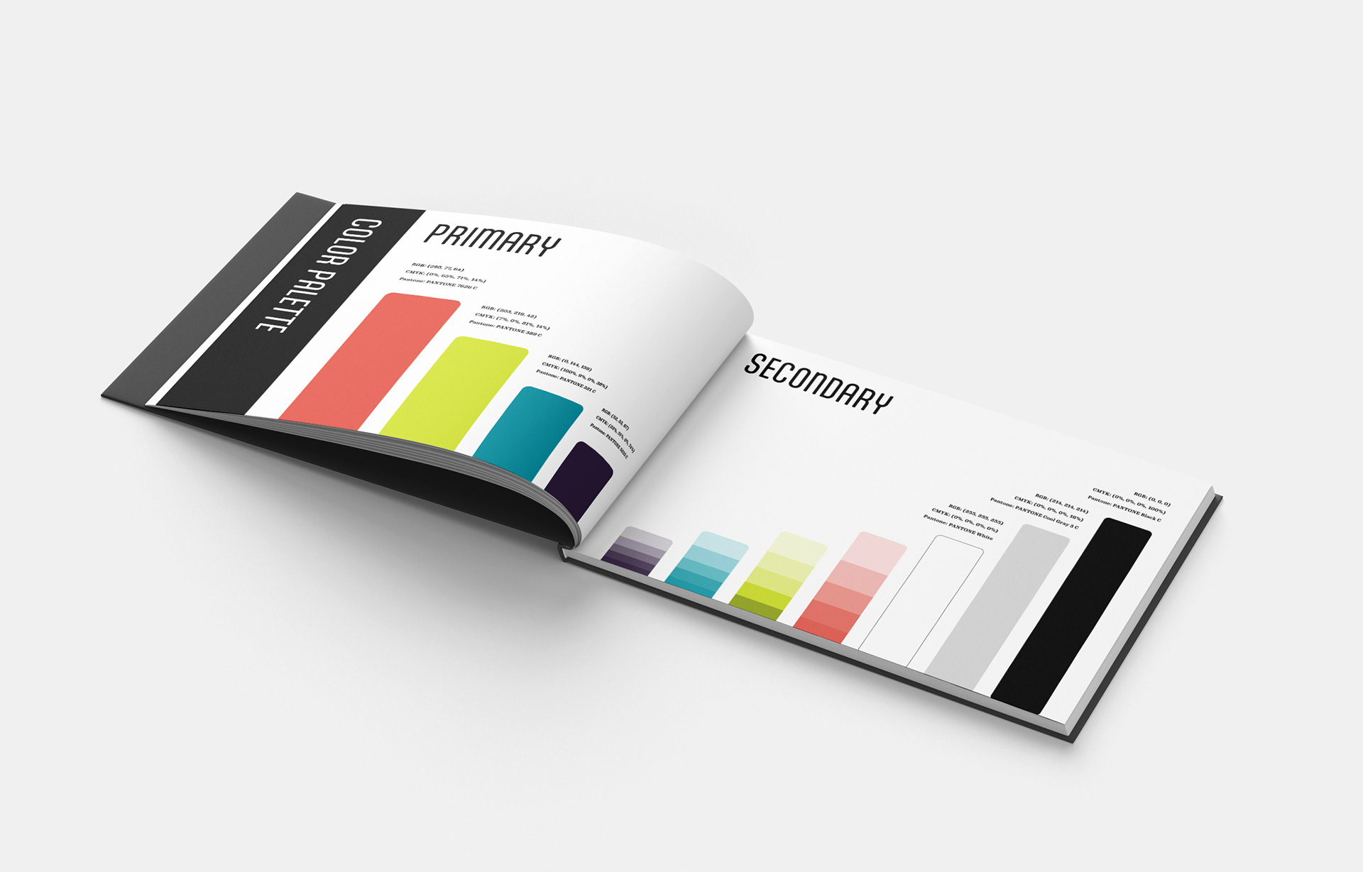
I reimagined Fender’s visual identity with a bold, expressive system inspired by 1980s postmodernism, a style in which more current audiences draw a sense of nostalgia. Rather than relying on the typical 1950s vintage aesthetic, the redesign taps into vibrant color, dynamic geometry, and playful logo usage to reflect genre inclusivity and creative freedom. The system includes a refreshed logo, brand brief, identity standards, an annual report, and business cards, designed to present Fender as culturally relevant, flexible, and visually distinctive for a new generation of musicians.
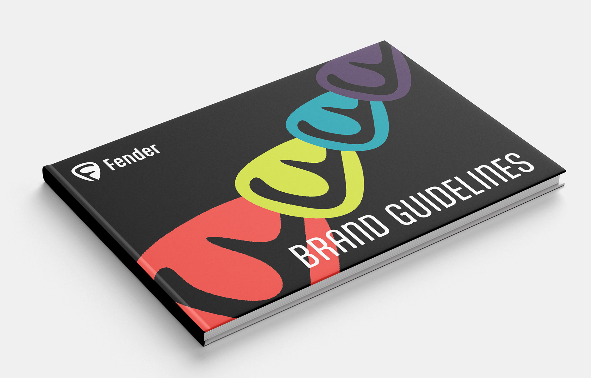
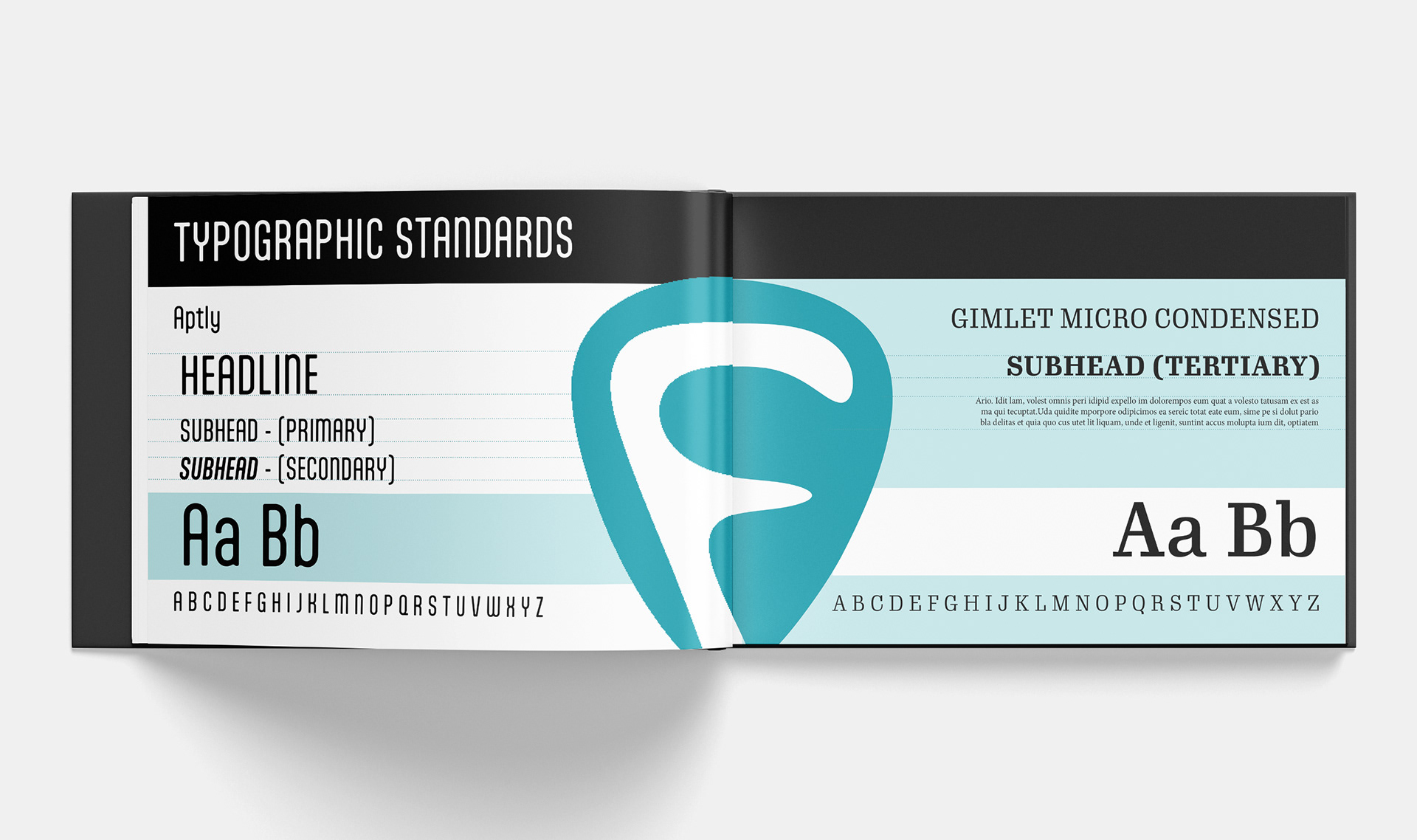
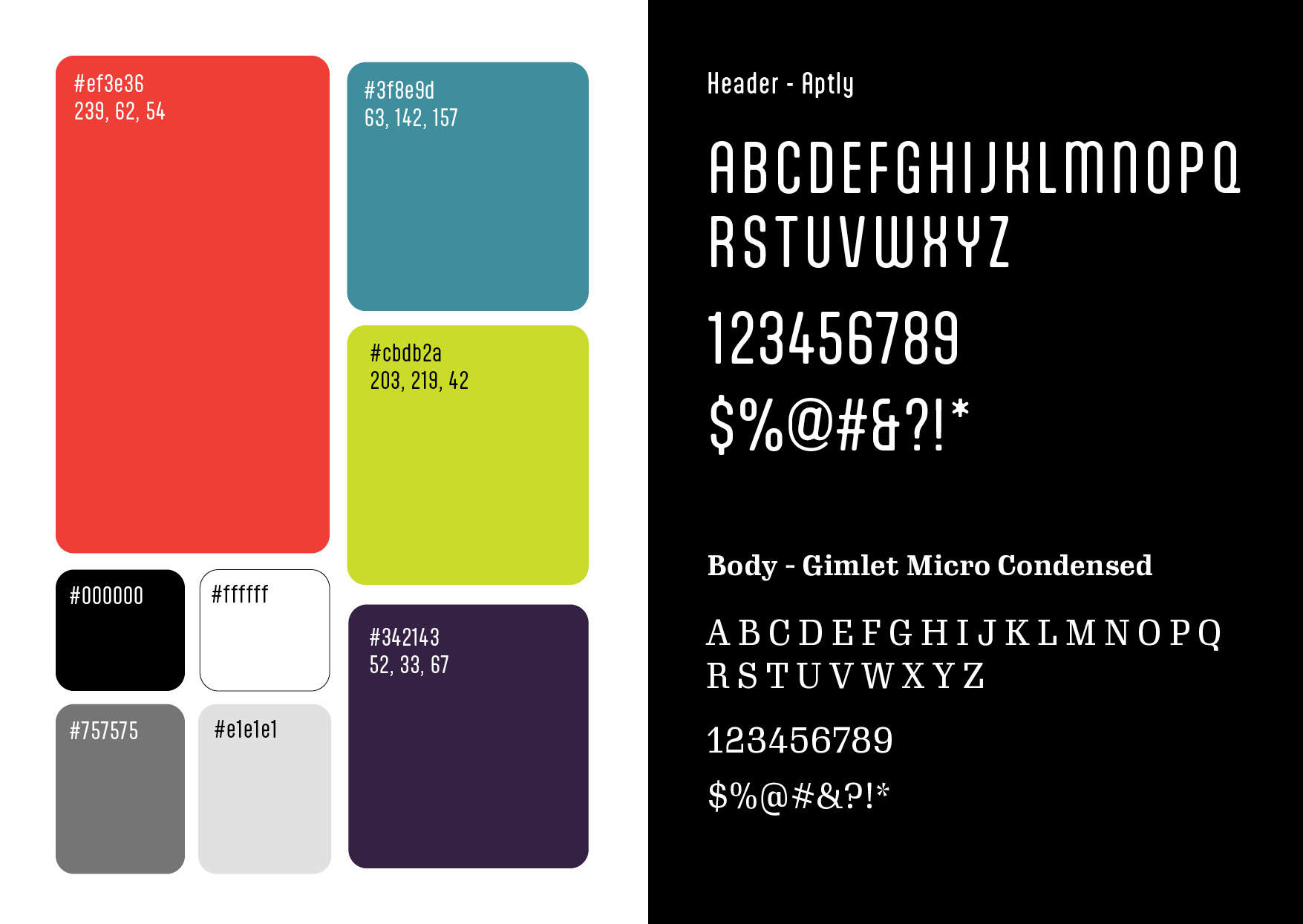
Brand Guidelines / Kit
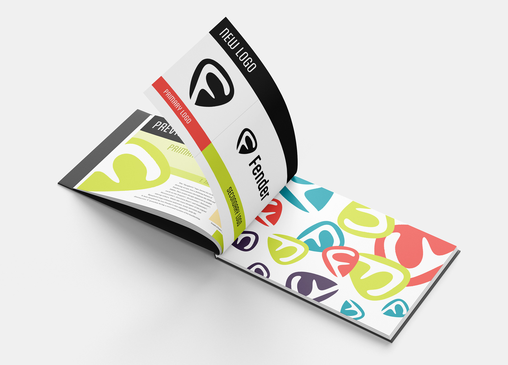
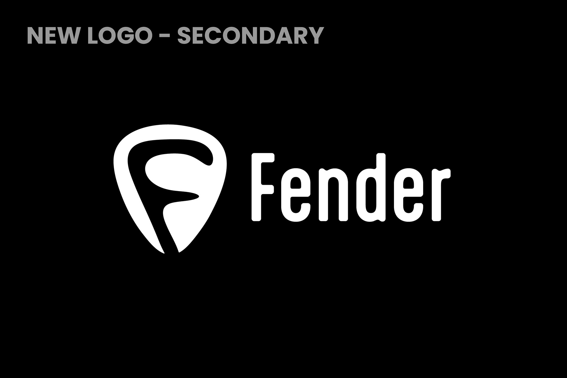
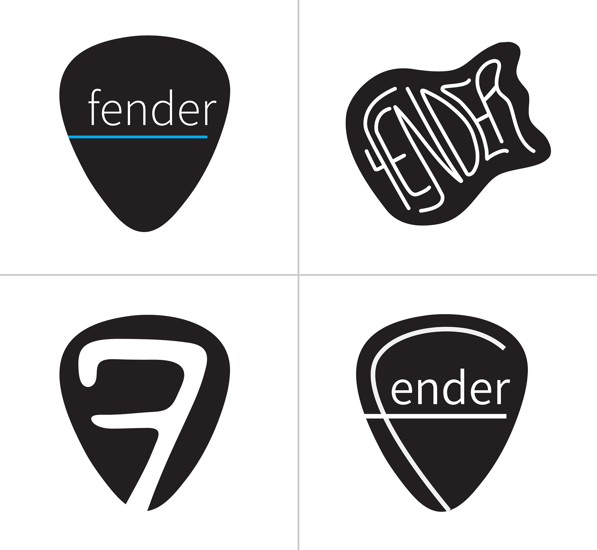
Logo


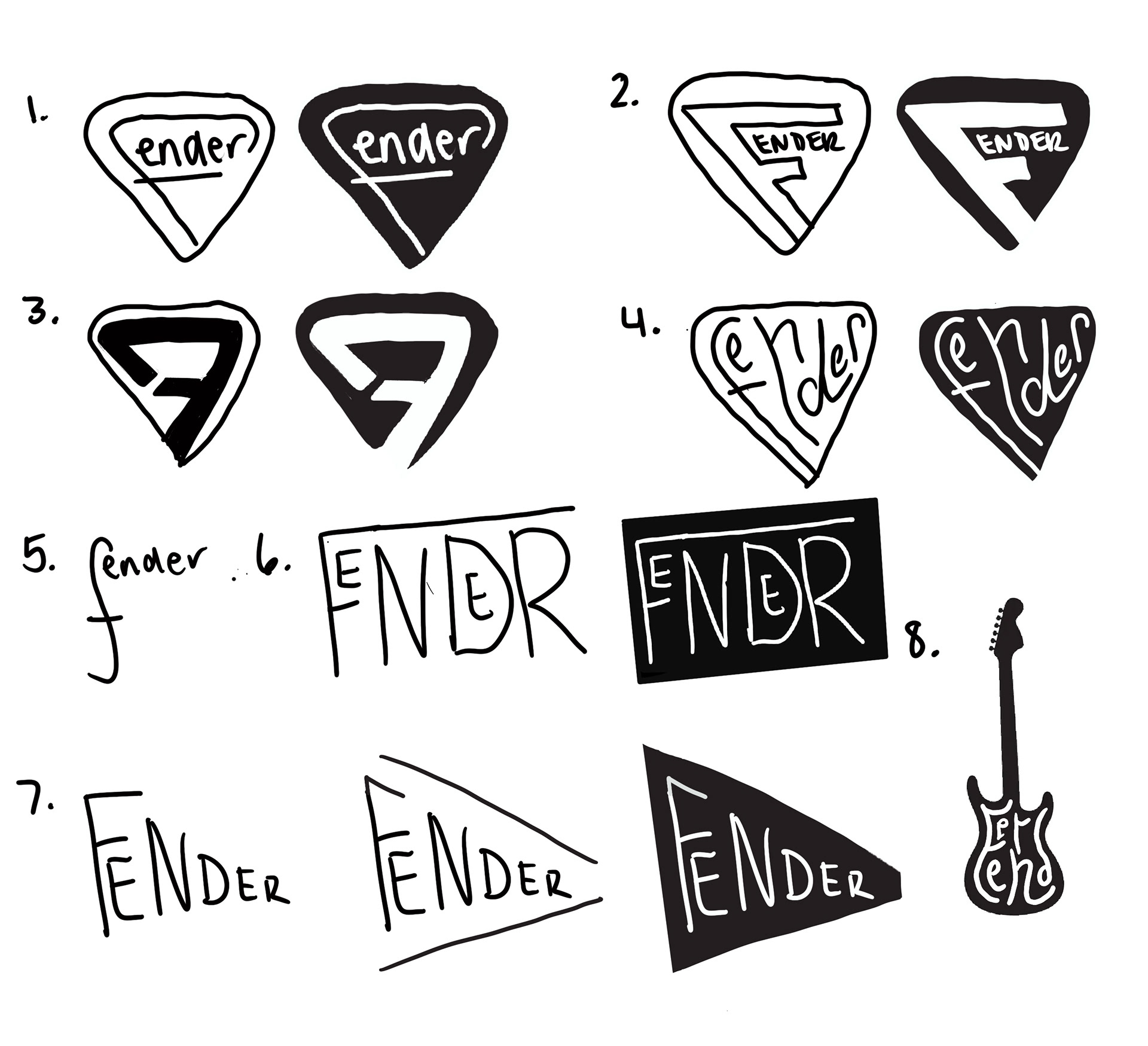
Potential Logos
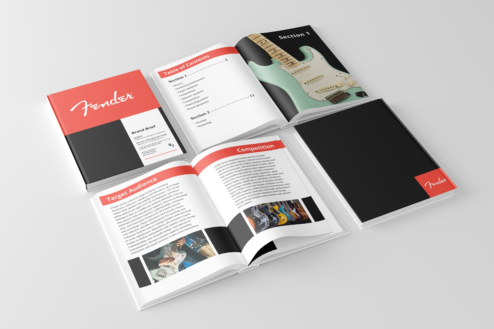
Brand Brief